Radial Gradient Background
Renders a customizable circular radial gradient background using SVG, optionally displaying children on top.
svgradial-gradientreact-nativebackgroundgradient
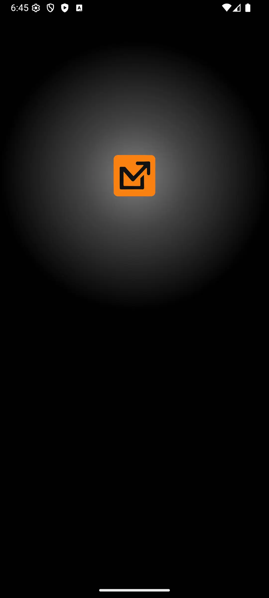
Preview
Installation
Step 1: Install react-native-svg
npx expo install react-native-svg
Step 1: Create the Gradient Component
Create a new file (e.g., src/components/RadialGradientBackground.tsx) and copy the following code:
RadialGradientBackground.tsx
import React, { ReactNode } from "react";
import {
StyleSheet,
View,
StyleProp,
ViewStyle,
Dimensions,
} from "react-native";
import Svg, {
Defs,
RadialGradient,
Stop,
Ellipse,
} from "react-native-svg";

const { width: screenWidth, height: screenHeight } = Dimensions.get("window");

type RadialGradientBackgroundProps = {
children?: ReactNode;
style?: StyleProp<ViewStyle>;
radiusFraction?: number; //how big you want the circle to be
startColor: string;
middleColor: string;
endColor: string;
};

const RadialGradientBackground: React.FC<RadialGradientBackgroundProps> = ({
children,
style,
radiusFraction = 0.5,
startColor,
middleColor,
endColor,
}) => {
// Calculate ellipse properties
const cx = screenWidth / 2;
const cy = screenHeight / 4;
const ellipseRadius = Math.min(screenWidth, screenHeight) * radiusFraction;
const ellipseDiameter = ellipseRadius * 2;

// Calculate position for the content container to overlay the ellipse
const contentTop = cy - ellipseRadius;
const contentLeft = cx - ellipseRadius;

return (
	<View style={[styles.container, style]}>
		{/* SVG container */}
		<Svg height={screenHeight} width={screenWidth} style={styles.svg}>
			<Defs>
				<RadialGradient
					id="gradient"
					cx={cx.toString()}
					cy={cy.toString()}
					rx={ellipseRadius.toString()}
					ry={ellipseRadius.toString()}
					gradientUnits="userSpaceOnUse"
				>
                    {/* you can customize the offset and opacity to your liking */}
					<Stop stopColor={startColor} stopOpacity={0.5} />
					<Stop offset={0.4} stopColor={middleColor} stopOpacity={0.4} />
					<Stop offset={1} stopColor={endColor} stopOpacity={0.25} />
				</RadialGradient>
			</Defs>
			<Ellipse
				cx={cx.toString()}
				cy={cy.toString()}
				rx={ellipseRadius.toString()}
				ry={ellipseRadius.toString()}
				fill={`url(#gradient)`}
			/>
		</Svg>

		{children && (
			<View
				style={[
					styles.contentContainer,
					{
						top: contentTop,
						left: contentLeft,
						width: ellipseDiameter,
						height: ellipseDiameter,
					},
				]}
			>
				{children}
			</View>
		)}
	</View>
);
};

const styles = StyleSheet.create({
container: {
	flex: 1,
	position: "relative",
},
svg: {
	position: "absolute",
	top: 0,
	left: 0,
	zIndex: 0,
},
contentContainer: {
	position: "absolute",
	zIndex: 1,
	backgroundColor: "transparent",
	alignItems: "center",
	justifyContent: "center",
},
});

export default RadialGradientBackground;
Usage
import React from "react";
import { StyleSheet, TouchableOpacity, Text, View, Image } from "react-native";
import RadialGradientBackground from "@/components/ui/RadialGradientBackground";
import { useAppColors } from "@/hooks/useAppColors";
import { SafeAreaView } from "react-native-safe-area-context";
const outlineIcon = require("@/assets/images/favicon.png");

export default function radialBackground() {
  const appColors = useAppColors();
  return (
  	<SafeAreaView style={styles.container}>
  		<View style={styles.content}>
  			<RadialGradientBackground
  				startColor={appColors.Neutral900}
  				middleColor={appColors.Neutral500}
  				endColor={appColors.Neutral0} //this should be you bg color
  			>
                  {/* you can add anything here it will be in the center of the radical background */}
  				<Image
  					source={outlineIcon}
  					style={styles.image}
  					resizeMode="contain"
  				/>
  			</RadialGradientBackground>
  		</View>
  	</SafeAreaView>
  );
}

const styles = StyleSheet.create({
  container: {
  	flex: 1,
  	justifyContent: "space-between",
  	alignItems: "center",
  	paddingVertical: 16,
  },
  content: {
  	width: "100%",
  },
  image: {
  	width: 64,
  	height: 64,
  },
});
Props
| Prop | Type | Default | Required | Description |
|---|---|---|---|---|
children | ReactNode | No | Optional content (components, text, etc.) to render centered over the gradient area. | |
style | StyleProp<ViewStyle> | No | Custom styles to apply to the root View container wrapping the SVG and content. | |
radiusFraction | number | 0.5 | No | Determines the gradient circle's radius as a fraction of the smaller screen dimension. |
startColor | string | Yes | The color string for the center of the radial gradient. | |
middleColor | string | Yes | The color string for the middle transition point of the radial gradient. | |
endColor | string | Yes | The color string for the outer edge of the radial gradient circle. |